The DIY Route: Building a Custom Editorial Section Without a CMS
Summary
As a UX designer with a DIY punk mindset, I wanted a bespoke portfolio without the bloat, hosting costs, and constraints of a traditional CMS. Here is how I built a lightweight, automated editorial section using raw Markdown files, a Figma design system, and a custom build.js script on Vercel. Developed with the help of Claude Code and Codex, this setup converts text into clean HTML at build time. It’s a practical, budget-friendly approach for managing small editorial sections in personal websites.
I have always been a huge fan of the DIY (do-it-yourself) philosophy. As a millennial who grew up with the last wave of 90s punk rock, I spent my youth building a lot of things on my own: books, fanzines, board games, you name it.
This approach has stuck with me to this day, and it’s the main reason I never had a portfolio website until now: I hate paying for something I could build myself. For years, I considered buying Semplice, but the hosting costs, WordPress (WordPress is a nightmare), and the lack of full customization always blocked me.
And since I’m no coding black belt, I never had the drive to start building it from scratch, either. Now, Claude Code and Codex have changed the rules of the game, so I decided to give it a shot.
Two weeks ago, I was messing around with Codex and Claude Code - mainly for another project - and out of curiosity, I thought: "Let's see how difficult it actually is to build my own portfolio." And here I am, telling you how to develop your own CMS-like editorial section using only Vercel and a creative approach.
Why should I build something that already exists?
Let's start by saying that this is a very punk-handmade solution, useful if you only want to pay for your Codex/Claude Code and Figma subscriptions. I already explored this approach for another personal project - which I'll be able to talk about soon - and it's mainly motivated by the fact that I'm currently unemployed - my choice, I needed a break - so I need to watch my budget.
Of course, this probably doesn't apply if you're building a newspaper website - but for a light blog section within a portfolio, or a site with a different primary focus, it's a very viable solution.
Starting point: repo organisation and file structure
The first thing to solve was this: how can I create editorial pages without writing a single line of HTML? Without a CMS, you normally have to bring together manually your content and CSS in an HTML file. No HTML, no page.
The second thing to solve was this: how can I control the content order and layout within the page? Because if you don't want a rigid, static template, you need flexibility. And without a headless editor like Storyblok or Contentful, you have to find a way to build your own. Or something close to it.
Then, I just needed some JavaScript to glue it all together.
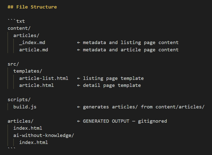
As you can see in the screenshot above, the actual HTML files for both the article listing and article detail pages are gitignored. That's not a mistake. It's because the final HTML is generated at build time: build.js reads the Markdown source files, transforms them into structured HTML, and injects everything into the page templates. The whole process runs automatically on every Vercel deployment - when there are new articles to be deployed - hooked into npm run build.
The source of truth is the .md file in the content folder. The building blocks are the UI components I designed in Figma. A strict naming convention is what build.js uses to piece everything together, following the exact content order I set inside the Markdown file.
To put it simply, all it takes is:
- A clean repo structure: a content folder for
.mdfiles, a template folder for the empty HTML layouts, and an assets folder for images. - A solid editorial design system, built as a shared
.CSSlibrary. - Naming conventions and rules so the functions in
build.jsknow exactly what to do.
Apart from the .md file logic and the JavaScript - or the entire coding part, to be honest - I believe that the overall design approach is deeply familiar to anyone who has ever worked with a CMS. Whether it's Storyblok, Contentful, Adobe Experience Manager, whatever: it always comes down to a set of UI modules representing how content is displayed, and a clear content structure representing what content is displayed.
As always in design, function has to meet form to convey meaning.
Execution: the editorial design system
I'll be honest about this: having designed quite a few - and maybe too many - CMS platforms in my career, this is the boring part to write about, in my opinion. But it's important for understanding the rest, so I have to cover it. I'll keep it short.
Let's think for a moment about what makes up an editorial website: text and images, basically. By abstraction, you have titles, subtitles, paragraphs, and captions for text, and square, rectangular, or multi-image compositions for visuals.
That being said, for this portfolio, I mainly needed to solve two things:
- How I wanted my text to be displayed, establishing a clear hierarchy between titles and paragraphs.
- Whether I wanted something flashier than plain text - and initially, that wasn't my plan at all. But then, you know what happens when a designer is left unsupervised with too much time to think...
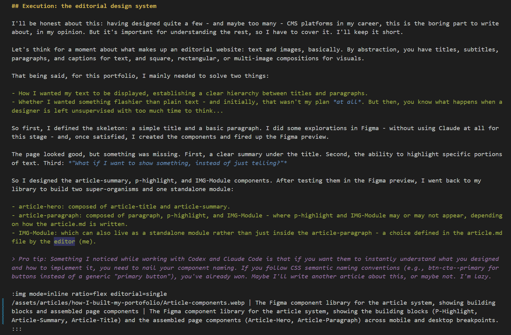
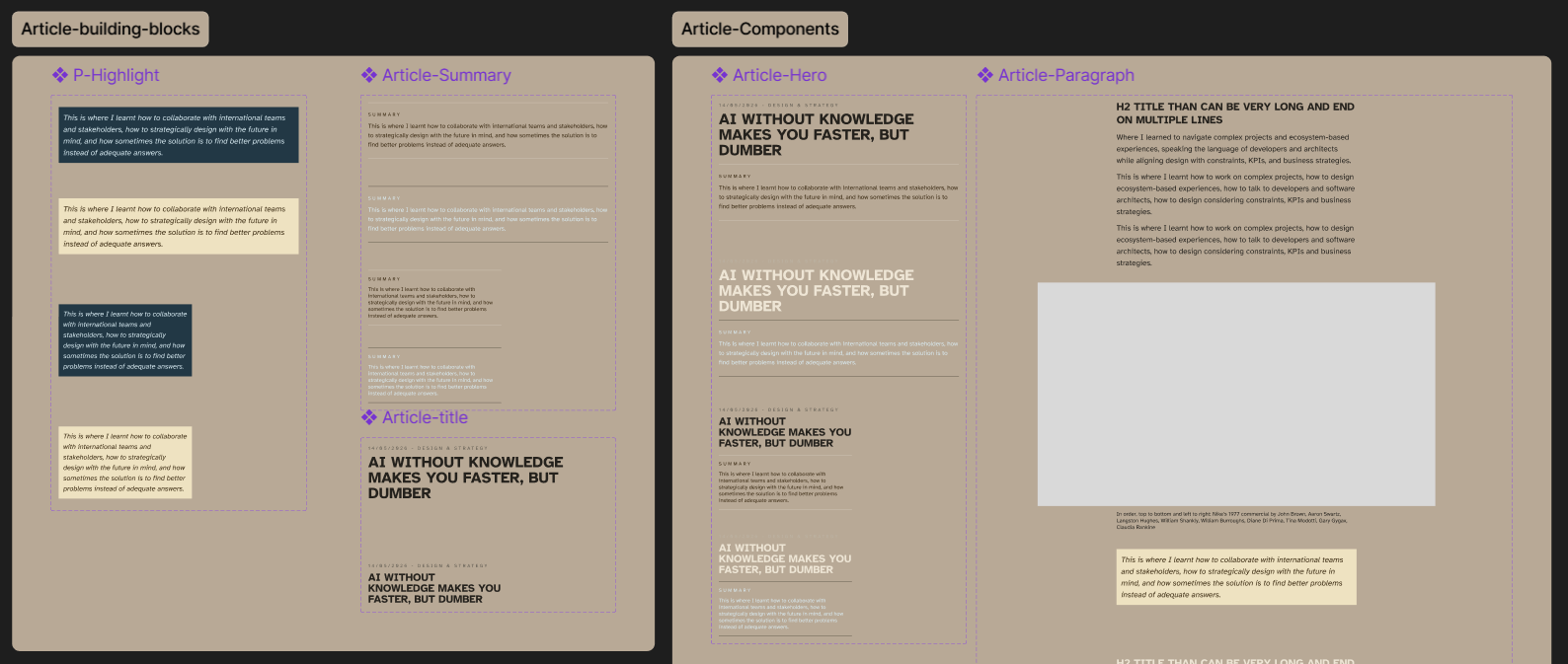
So first, I defined the skeleton: a simple title and a basic paragraph. I did some explorations in Figma - without using Claude at all for this stage - and, once satisfied, I created the components and fired up the Figma preview.
The page looked good, but something was missing. First, a clear summary under the title. Second, the ability to highlight specific portions of text. Third: "What if I want to show something, instead of just telling?"
So I designed the article-summary, p-highlight, and IMG-Module components. After testing them in the Figma preview, I went back to my library to build two super-organisms and one standalone module:
article-hero: composed of article-title and article-summary.article-paragraph: composed of paragraph, p-highlight, and IMG-Module - where p-highlight and IMG-Module may or may not appear, depending on how the article.md is written.IMG-Module: which can also live as a standalone module rather than just inside the article-paragraph - a choice defined in the article.md file by the editor (me).
As I said before, a designer left unsupervised with too much time to think is a dangerous thing. At this point, what I was still missing was some flexibility for the images. So I went back to Figma and started sketching.
I did this because the article section is more of a side-quest than the core part of this website, since this is a portfolio first and foremost. I needed flexibility to display my case study visuals - nothing emotional, by the way, since I'm mainly a Product Designer focused on strategy, flows, and systems. And, since I like to design with scalability in mind, the exact same module created for this article section will be the one I use in my case study detail pages.
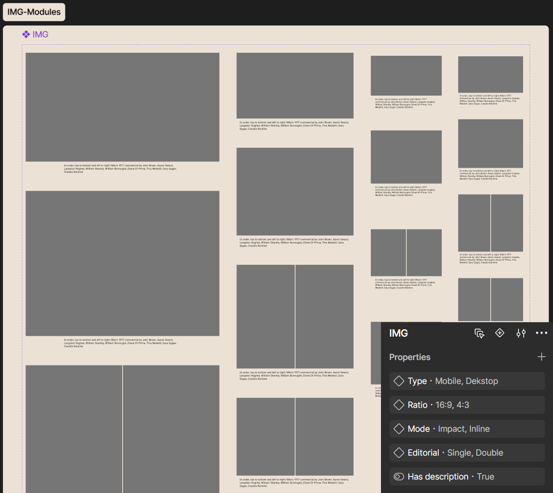
In short, I added an image module (IMG-Module) that works based on three main parameters:
- Ratio: 16:9, 4:3, and flex - basically a free-ratio image that adapts to the container width (the option I used for this article).
- Mode: impact, for large images wider than the article container; inline, which is the format I used here.
- Editorial: to decide whether to use a single or double visual layout within the IMG-Module.
With that sorted, I was ready to define the final naming conventions for the article.md triggers and build.js.
An .md file to bind them all
Now that the editorial system was complete and developed, all that remained was to establish the right naming convention to be able to trigger the right editorial modules directly from the .md file.
While standard elements like H1 or H2 were the easy part - since I could just use the # and ## Markdown properties for headings and easily match them with the related --fs-font-display utility class via build.js - other elements required a bit more thought.
The first thing I had to map out was the spacing. In short: how I wanted the layout gaps to work, which spacing tokens to use within a paragraph versus between two paragraph blocks, and how to trigger them. I decided that an empty line in the .md file corresponds to an in-paragraph gap, while an H2 (##) or a custom :::paragraph container triggers a new paragraph block - the distinction being that a paragraph block may or may not have a title.
Next, I had to decide how to display the p-highlight. After a few trials, I opted for the standard Markdown blockquote syntax (>), followed by the text to highlight.
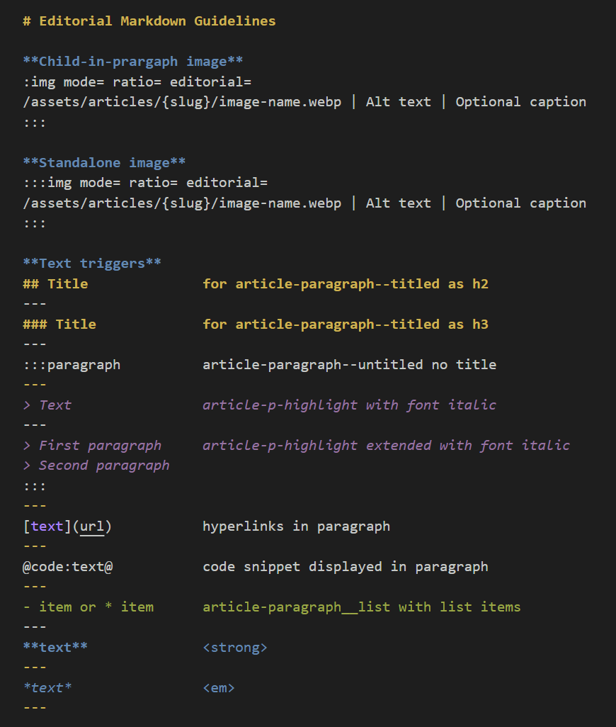
Managing the images was the trickiest part. First of all, I wanted two placement options: inside the paragraph or outside of it. The visual difference on the page comes down to spacing, whether they only have their built-in padding, or padding plus the structural layout gap. After some trial and error, I landed on this model:
- :img and :::img triggers:
:imgfor images inside the paragraph,:::imgfor standalone ones outside of it. - Figma variables as commands: The exact same parameters designed in Figma (
ratio,mode,editorial) are passed as simple inline text commands to control the Image-Module's appearance. - Dynamic paths: The article slug and image filename are used to retrieve the correct assets from the
assets/articles/folder. - Content fields: Built-in fields for alt text and caption text.
Over time, I'll probably figure out how to add inline separators and other components, but for now, I'm satisfied with the flexibility this system offers.
The final hurdle was figuring out how to display metadata on the article listing page. I decided to leverage the Frontmatter of the article's .md file. In short: every time I push a new Markdown file to the repo, a card is automatically generated on the listing page using the Frontmatter metadata, which, by the way, also handles SEO and Meta tags.
Lastly, I applied this exact same logic to the "related content" module at the end of the page. You probably won't see that component right now, since at the time of writing, this is the first and only article live on my portfolio - but never say never.
Closing thoughts: how difficult it is and how much time it takes
If I have to estimate how much time it took me to land on the final result, I'd say roughly two full days - to be clear, a "full day" in my book means about 8 hours.
I split the first day in two: a brief planning session with Codex to define all the to-dos, the required technical steps, and the testing workflow before starting development; then, I dedicated myself entirely to designing the components, testing them in Figma preview, adjusting what didn't work, and polishing everything.
The second day was dedicated to development and testing - starting from atoms and components to properly build the shared CSS library, and ending with the build.js integration and tests.
To be honest, I already had a clear use case in mind, since I'm using a similar, simplified approach to build pages for another tool I'm developing - a TTRPG generator. If I had to start from absolute scratch, it probably would have added two more days to the total count.
As for difficulty, I believe it's a relative thing. To me, it all felt very natural - an "if this... then that" thinking process that took me from idea to solution almost without friction. But, as I said at the beginning of the article, this is a design process I've gone through more times than I can remember. The only thing I truly had to handle was the technical integration and the JavaScript logic - and that was the fun part, to be honest, because I didn't even know if landing on this exact result was possible.